Any website’s success depends on its web design typography, which makes it easier for us to read and understand the information. When a website’s typography is effective, it goes unnoticed by users. If it fails, viewers frequently leave the page without staying long.
Every website needs text as a basic building block, so it is essential for website owners to invest effort in their site’s web design typography. By emphasizing the appearance and readability of your words, you ensure that your readers can easily engage with your content.
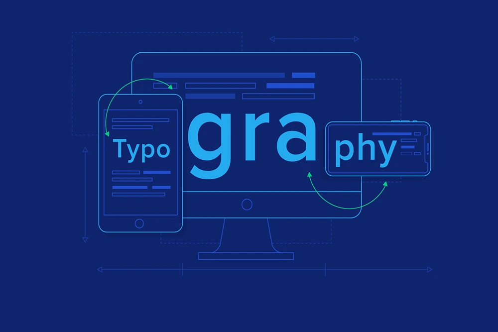
In order to start your journey with web design typography, read this guide. In this guide, we have explained some basic terms related to web design typography and its rules. Let’s get started.
What is Web Design Typography?
Web Design Typography, which includes many aspects of how text is displayed, is in fact the art and practice of arranging text. In the context of web design, typography is essential to producing a readable and pleasing text.
In order to improve readability and attractiveness on a screen, it requires choosing the right fonts, figuring out font sizes and styles, organizing text elements, and using different typographic principles. Web design typography implementation may enhance the user experience by using typography best practices to efficiently express information, establish hierarchy, provoke sentiments, and guide visitors throughout the content.
Basic Terms In Web Design Typography
Typefaces and Fonts
The difference between typefaces and fonts is mostly unclear because many people use them interchangeably.
A typeface is a representation of a particular design aesthetic that includes a variety of characters in various sizes and weights. However, the visual depiction of individual text characters is provided via a font.
Fonts are the various weights, widths, and styles that make up a typeface, while a typeface is, to put it simply, a collection of related fonts. In this section, we will discuss the best-looking fonts for websites.
1. Serif – Best for Readability
Serif typefaces have extra markings at the ends of the letters. These minute marks, strokes, and details give serif typefaces a sense of tradition, history, authority, and integrity.
Because of these characteristics, serif typefaces are frequently used for book fonts, newspaper titles, and other contexts that seek to evoke a “classic” aesthetic.
Times New Roman, the default typeface in Microsoft Word, is an illustration of a serif font. The sans-serif font Calibri took its place in 2007 as a replacement.
2. Sans-serif – Best for On-Screen Usage
Sans-serif typefaces get their name from the lack of serifs, which are the aesthetic dashes and strokes in more traditional fonts.
Sans-serif fonts have a contemporary, bold appearance due to the absence of serifs. Because of their great readability, they are more attention-grabbing when used in headlines than serif fonts.
Examples of sans-serif typefaces include Arial (which serves as Google Docs default).
3. Decorative – Best for Names, Logos or Titles
Decorative typefaces are primarily created to improve the aesthetics of web design typography. They are used in brand names, logos, and brief titles where visual impact is essential. Decorative fonts are appropriate for attention, but imagine attempting to read a complete text in such typefaces—it would probably be difficult! So, they are not used for the whole text.
Decorative typefaces offer an extra layer of visual appeal and distinctiveness, making them an excellent option for anyone who wants to show their demeanor, feelings, and uniqueness through their font choice.
4. Script – Best for Headlines to Catch the Reader’s Attention
A script font imitates the look of cursive or linked writing. It is similar to calligraphy or handwritten cursive. Script typefaces are used in many different projects and applications.
However, this style is difficult to utilize in headlines or non-decorative contexts because of readability issues. Therefore, when organizing body copy and other large textual content, it is advised to avoid using script typefaces.
Kerning
Kerning in web design typography describes the horizontal distance between two particular characters. To improve legibility and avoid awkward gaps, the spacing between individual letter pairs must be adjusted. The kerning widths of various typefaces may vary, ensuring that all letters fit together perfectly. Most commonly used typefaces include predefined kerning values for every combination of nearby characters, allowing for a compact and pleasing arrangement.
Tracking
Tracking relates to the distance between letters, just like kerning does. Instead of concentrating on specific letter pairs, tracking considers the general spacing between letters throughout an entire line or block of text.
To ensure legibility in typography, accurate tracking is essential. It enables us to assess if a line of text appears compressed or spaced out enough.
Leading
The vertical distance between text lines is known as leading. It can be measured in pixels or points. Inadequate leading can make text lines appear crowded and challenging to read. On the other hand, too much leading can cause a disorganized and ineffective use of space, making the text more difficult to follow.
In typography website design, finding the ideal leading balance is crucial to make the text readable for visitors. You can enhance the text’s readability and flow and make it more pleasurable for readers by making the proper leading adjustments.
Hierarchy
When it comes to structuring web pages, hierarchy is especially important for those with a lot of material. Topic-based text is segmented into discrete sections, with headings used to identify and name each component. The hierarchy of the page is determined by how the text is arranged, from most prominent to least prominent.
For example, in a blog post, the most prominent section is the title mentioned in H1.
Title – H1
Heading – H2
Subheadings – H3 and so on…
The importance of hierarchy lies in its capacity to improve comprehension and navigation. Readers should be able to quickly discover and access the pertinent sections by merely looking at the headings.
Web Typography Best Practices
There are a few best practices to follow for typography in ux ui design. Here are some essential typography rules for web design:
Set the Proper Font Size
It’s important to size text properly while designing websites. Consider the following UI font size guidelines for web typography:
1. Use Pixels (px) as the Measurement Unit for Font Size.
You should use pixels (px) as the unit of measurement for font size. For uniformity across browsers and devices, pixels offer a standardized unit online.
2. 16px minimum Font Size
16 px should be the minimum font size for the body text. The majority of users can read a font at this size without needing to zoom in. It offers a comfortable reading space.
3. Set up a hierarchy
By employing several font sizes for headings, you can clearly define a visual hierarchy. Heading sizes often drop from H1 to H2, H3, and so forth. Users may now analyze and navigate the content more rapidly as a result.
4. Take into Account Font-Weight Variations
You can use various font weights to better emphasize the distinction between headings and body text. Using a bolder or stronger weight for headings as opposed to the body text’s standard weight, is a good strategy for web design typography.
5. Avoid using Huge Fonts.
While creating a visual hierarchy is crucial, it’s just as essential to avoid using excessively large fonts. Extremely large font sizes can be obtrusive and have a detrimental effect on readability and overall design.
You must follow these font size guidelines for responsive websites.
Note: When choosing font sizes for web design typography, keep in mind that these are only general recommendations, and it’s essential to take the context, target demographic, and overall design aesthetic into account. To achieve the best readability and aesthetic appeal, the typeface must be tested and reviewed across various browsers and devices.
Don’t Use More Than Two Typefaces
In web design typography, you should use fewer typefaces overall on your website to maintain a visually unified design. Use no more than two different typefaces overall on your website. Many websites use a single typeface efficiently, utilizing different font styles within that typeface for varied purposes, including headings, body text, and button labels. This strategy offers essential aesthetic differentiation for various content elements.
Use Sans Serif – Best Looking Font for Body Text.
It is generally advised to use a sans-serif font for body text in web design typography. Although serif fonts are frequently employed in printed writing, experts in typography believe that sans serif fonts are easier to read in digital environments. Our eyes can read content on the web more easily because sans serif fonts lack ornamental strokes.
Serif typefaces shouldn’t necessarily be entirely avoided on your website, though. They can still offer contrast and grab attention in titles, headings, pull quotes, or decorative sections. Serif fonts can function as visually appealing elements in such circumstances. However, it is preferable to use a sans-serif font for blocks of text that call for simple readability and comprehension
Use Colors Wisely and Strategically
It is essential to use colors in web design thoughtfully and strategically if you want to produce a user-friendly and aesthetically pleasing experience. Web design typography best practices for using colors are listed below:
1. Contrast
To ensure the best legibility, make sure the text color and the background color are sufficiently different. Utilize contrast ratios that adhere to the WCAG standards (4.5:1 for most text, 3:1 for large, bolded text). Make sure the contrast ratio adheres to suggested criteria by using internet tools for assessment.
2. Images with text on top
Use caution when adding text to images. Use contrasting colors, a semi-transparent overlay, or text shadows to make the text easier to see while retaining readability.
3. Body Text Color
Consistently use the same color for your body text throughout your website. To avoid misunderstanding with hyperlinks, avoid using blue as the default color for ordinary text and choose a color that contrasts well with the background.
4. Hyperlink Color
Use a contrasting color to mark hyperlinks to distinguish them from regular text. Make sure the color of the hyperlink stands out from the surrounding text and is unique.
5. Avoid the Use of Red and Green Colors
Red-green colour blind people may have trouble seeing these hues. In order to enhance color distinctions, use extra visual signals such as icons, underlining, or bolding.
Maintain Proper Line Spacing
The following suggestions should be taken into consideration to maintain adequate line spacing in web design typography:
1. Line Height (Leading)
Adjust the line height to create the proper distance between text lines. The leading should be 50% bigger than the text height.
2. Headings
For headings, try to keep the line height between 1.2 and 1.5 times the font size.
3. Space
Use a suitable amount of space between paragraphs to enhance readability and establish visual separation. The standard practice is to set the spacing between paragraphs to roughly 2.5 times the font size; you can change it depending on your design and content.
Note: For various screen sizes and devices, it may be necessary to alter the line height and paragraph spacing. To achieve uniform spacing across devices, consider employing responsive units such as percentages or viewport-based measurements.
Maintain 60-70 Characters/Line
One of the most important web design typography rules is to maintain the text’s line length between 40 and 80 characters. Readers favor this range because it makes reading more comfortable. Too-short lines demand frequent eye movements, which can distract, while too-long lines can cause boredom, discomfort, and trouble locating a new line.
Maintaining your lines within the recommended range will improve readability and relieve readers’ eyes from strain.
We hope you now have a better understanding of the role of typography in responsive web design. So, leverage the expertise of web design services to achieve a visually appealing and engaging website.
Final Words
Web design typography is essential in determining a website’s overall aesthetics, readability, and user experience. You may develop aesthetically appealing and engaging website text that clearly conveys your message to users by mastering the basic concepts and best practices of web design typography mentioned in our guide.
 Call us : +1 (786) 947-6105