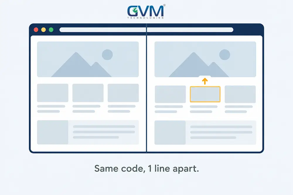
Chrome shows the page exactly as designed. Your website looks broken in Safari on the identical URL, a button loses its color, or a section collapses in Firefox. Nobody edited the code in between.
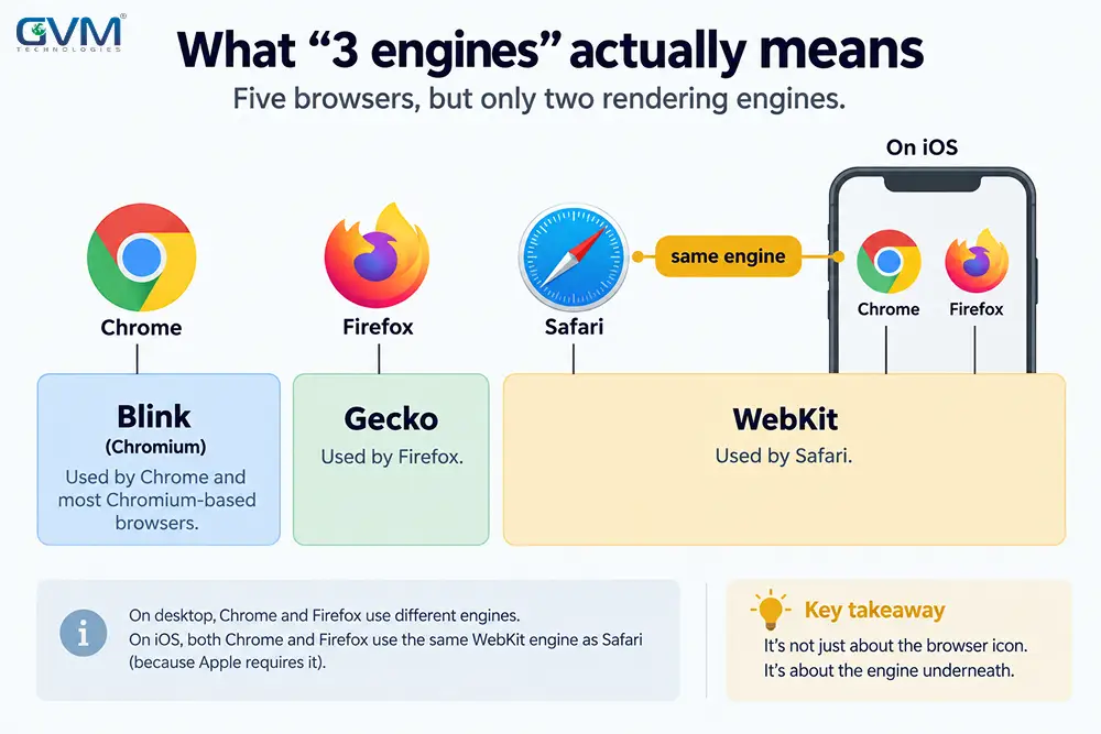
Quick answer: Chrome runs on Blink, Firefox runs on Gecko, and Safari, plus every iPhone browser, runs on WebKit. Our QA and cross-browser testing team finds the 1 skipped property in minutes, in the browser’s own DevTools, instead of rewriting the page.
Key takeaways
- A website looks broken in Safari for 1 CSS property, not a broad “compatibility problem,” in most reports. Isolate it before rewriting anything.
- Every browser on iOS, Chrome and Firefox included, must render through Apple’s WebKit engine — a “Firefox” bug on an iPhone is really a Safari-engine bug.
- Chrome carries roughly 65 to 68% of global traffic against 16 to 18% for Safari and near 3% for Firefox, per StatCounter, enough of a gap that Chrome-only testing ships these bugs for months.
- A page rendering as a plain, unstyled list of links, on more than 1 site at once, is rarely a code bug — usually a reader mode, an accessibility view, or a browser setting.
- Safari added
gapsupport inside flexbox only in Safari 14.1, April 2021; templates built earlier can still silently ignore it.
Rule out these 6 look-alikes before you touch any CSS
Not every website looks broken in Safari for a CSS reason. Several unrelated issues produce the identical complaint, and chasing CSS when the real cause sits elsewhere wastes hours.
The false-alarm table
| What the visitor sees | What it actually is | First check |
|---|---|---|
| Every page is plain text: default font, no colors, left-aligned | A stylesheet toggle, a user-stylesheet extension (Stylish is common), or a page-style override | In Safari, check Settings, Advanced, Style sheet is none selected; in Firefox, check View, Page Style |
| The whole page reduces to a nested bullet list of links, on your site and unrelated ones too (Amazon, eBay) | A reader mode, a screen-reader outline view, or an accessibility simplified view active on that device | Toggle reader mode off; ask for a screenshot with accessibility settings checked |
| “Not Secure,” or the page half-loads, only in Safari or Firefox | A reissued or “rekeyed” SSL certificate can pass Chrome’s checks while failing Safari’s stricter certificate-chain validation | Check the padlock and certificate date in the affected browser specifically |
| Looks stuck on an old version after a fix went live | A stale browser, page-cache-plugin, or CDN cache is still serving the old stylesheet | Hard refresh, then test in a private window before assuming the fix failed |
| Fine at home, broken on the office network or with a VPN active | A corporate proxy, an ad blocker, or Apple’s iCloud Private Relay is stripping or delaying a resource | Disable the VPN or Private Relay and reload |
| Only 1 visitor reports it | A browser extension, forced dark mode, or a saved zoom level on that 1 device | Ask for a screenshot from a private window with extensions off |
A common pattern: jumping straight to a CSS rewrite while skipping this table, then losing an afternoon to a cached stylesheet.
What to capture if the bug is real
Get 3 things before changing code: the exact URL, a screenshot, and the browser’s full version number, since Safari 17 and Safari 26 do not support the same feature set.
Why 1 engine breaks what the other 2 render fine
A website looks broken in Safari and not Chrome because a browser is a shell around a rendering engine, and the 3 major engines ship different CSS features, and different defaults, on different days.
Three icons, three engines
| Browser | Engine |
|---|---|
| Chrome, Edge, Brave, Opera, Samsung Internet | Blink |
| Firefox (desktop and Android) | Gecko |
| Safari, and every browser app on iPhone or iPad | WebKit |
The iPhone trap almost nobody checks
Apple requires every iOS browser to render through WebKit; “Chrome for iOS” and “Firefox for iOS” are Safari’s engine in a different toolbar.
| What you think you tested | What you actually tested |
|---|---|
| “Firefox,” on an iPhone | WebKit (Safari’s engine), not Gecko |
| “Chrome,” on an iPhone or iPad | WebKit, not Blink |
| “Firefox” or “Chrome,” on a Windows or Android device | The real Gecko or Blink engine |
A bug in “Firefox on my phone” that vanishes on a laptop is a WebKit bug in disguise. The EU’s Digital Markets Act requires real independent engines on iOS by January 1, 2027, so this table stays true for now.
No browser is “correct,” the outlier just depends on the property
A common cross-browser complaint: a date or short string wraps onto 2 lines in Chromium specifically, while Firefox renders the identical markup correctly, fixed with 1
white-space: nowraprule.
Most guides treat Chrome as the reference and Safari or Firefox as “wrong.” That example shows why the framing breaks down: whichever engine implements a property differently is the outlier for that property, not always the same one.
The exact CSS properties behind most 2026 Safari or Firefox breakage
When a website looks broken in Safari specifically, match the broken element against this table before guessing at a rewrite.
The property-by-property fix table
| Property | Breaks as | Fixed since | Fix |
|---|---|---|---|
gap in display: flex |
Items sit flush, no spacing | Safari 14.1 (macOS), iOS Safari 14.5, April 2021 | Update Safari, or add margin as a fallback for older traffic |
100vh on mobile |
Content hides behind, or overflows, the address bar | Use 100dvh (dynamic viewport height) |
Swap the unit; keep 100vh as a fallback for older engines |
backdrop-filter |
A blur effect shows no blur | Needs -webkit-backdrop-filter alongside the standard property |
Declare both properties together |
position: sticky in overflow: hidden |
A sticky header scrolls away instead of sticking | Long-standing Safari-specific interaction | Move overflow: hidden to a different wrapper |
:has() selector |
A parent-selector rule does nothing | Firefox 121, December 2023 | Wrap in @supports selector(:has(a)) with a fallback |
::-webkit-scrollbar |
Custom scrollbars show in Chrome and Safari, default in Firefox | Firefox never adopted -webkit- scrollbar pseudo-elements |
Add standard scrollbar-width and scrollbar-color too |
Safari 26’s Liquid Glass toolbar issue
Since Safari 26, released September 15, 2025, Safari’s toolbar samples the background-color and backdrop-filter of fixed elements near the viewport edge to tint itself, even at opacity: 0. A transparent root background then falls back to a white or black bar behind the toolbar.
If a page was fine through Safari 18 and broke only after a visitor updated, check 2 things first:
- A missing
viewport-fit=covertag in the page head. - No explicit
background-colorset onhtmlandbody, not just the visible components.
On modern frameworks, the same asymmetry shows as animation: a mobile nav that never fully disappears, or a laggy blur, on Safari specifically.
The page-builder pattern nobody blames until it costs a day
On WordPress sites, a website looks broken in Safari because of generated CSS, not hand-written CSS, more often than people expect. Elementor add-on packs (ElementsKit is a frequently reported one) and Divi both write their own inline styles on top of the theme.
Why Chrome hides the same broken code
| In Chrome | In Safari or Firefox |
|---|---|
| Tolerates small errors in generated CSS, renders something usable anyway | Parses the identical rule more strictly and drops the whole block |
| Padding, backgrounds, and headings look untouched | Padding disappears, or headings shift left |
How to confirm the plugin in under 5 minutes
- Switch to a default theme, or disable the suspect add-on pack.
- Reload the page in the broken browser.
- If the layout snaps back, update or replace that plugin instead of hand-editing its generated CSS.
- Clear the host’s own server cache too; shared-hosting-plus-Divi setups often cache the broken version separately from the fix.
A quality assurance pass before a plugin update goes live catches this before a visitor ever does.
A 10-step checklist that finds the cause instead of guessing
Once a website looks broken in Safari and the false alarms are ruled out, work through this order and stop at the first step that reveals the cause.
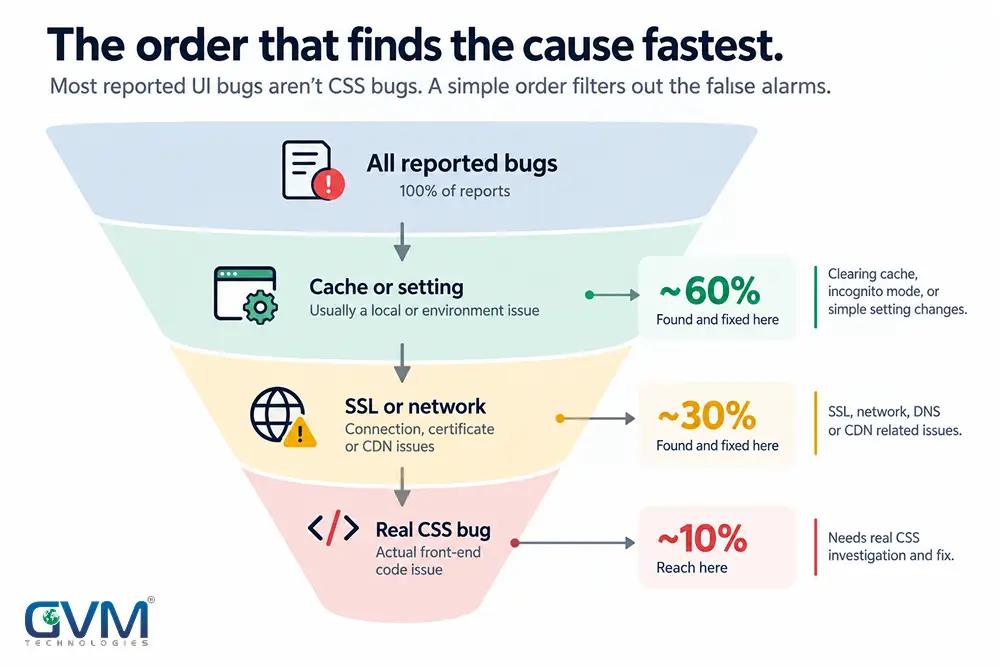
- Reproduce it in a private window on 2 devices to rule out extensions and local cache.
- Screenshot the broken element and record the exact browser version.
- Open that browser’s own DevTools or Web Inspector; unsupported properties usually show a strikethrough.
- Check the specific property on caniuse.com.
- Check the console for JavaScript errors that could leave a class or inline style unapplied.
- Check what deployed, updated, or changed before assuming a browser update caused it.
- Wrap the fix in
@supports (property: value) { }for a deliberate fallback. - Purge the browser cache, page-cache plugin, and CDN cache, in that order.
- Re-test on the real device that reported it, not only an emulator.
- Add the page to a standing cross-browser check so the next release doesn’t repeat it.
Ten steps sounds slow mid-panic, but most reports die at step 4 — the same order our QA team runs before every release.
Test Safari and Firefox without owning every device
| Tool | Use it for | Free tier |
|---|---|---|
| Playwright | Real WebKit, Gecko and Chromium engines, run locally on Windows or Linux | Yes, open source |
| BrowserStack | Real Safari and Firefox on real devices, in the cloud | Limited trial |
| LambdaTest | Lower-cost cloud alternative for live manual checks | Yes, for spot-checks |
| Safari Technology Preview | Apple’s own preview of upcoming WebKit changes | Yes, macOS only |
| caniuse.com | Feature-by-feature browser support tables | Yes |
Playwright alone, in a CI pipeline, flags most reasons a website looks broken in Safari automatically, on ordinary hardware, no Mac required.
Stop it from recurring on the next release
A website looks broken in Safari again on the very next release without these 5 habits.
- Load a CSS reset or normalize.css first, so every engine starts from the same baseline margins and fonts.
- Write
@supportsfeature queries instead of guessing; an unsupported property is usually ignored silently, which is exactly how these bugs slip through. - Put Safari and Firefox in the same pre-launch checklist as Chrome, not an afterthought after a complaint.
- Treat a plugin or theme update as a testing event on any WordPress build, especially one running a page builder.
- Keep a staging environment, the same discipline that prevents a site going down after a bad deploy.
Mistakes that turn a 10-minute fix into a week of guessing
A website looks broken in Safari for days longer than it should when a team makes 1 of these 6 mistakes.
- Rewriting large sections of CSS before isolating the 1 property responsible.
- Testing only on your own browser versions, which may sit months ahead of what visitors run.
- Treating an SSL warning or a half-loaded page as a CSS bug.
- Chasing a “Firefox on iPhone” report as a Firefox issue instead of a WebKit one.
- Skipping the cache purge, then concluding a working fix “didn’t work.”
- Running no cross-browser step at all before release, so the same bug class returns.
FAQs
1. Why does my website look fine in Chrome but broken in Safari?
A website looks broken in Safari because Safari runs on WebKit, which supports a different subset of CSS and applies different defaults than Chrome’s Blink engine. The specific property is usually visible as a flagged, unsupported rule in Safari’s own Web Inspector.
2. Why is my site broken in Firefox specifically?
Firefox runs Gecko. A property Chrome and Safari both support can still behave differently in Firefox, since new CSS reaches each engine on its own schedule; check the exact property on caniuse.com.
3. Is Chrome on my iPhone the same as Chrome on my laptop?
No. Every iOS browser, Chrome and Firefox included, renders through WebKit. A bug in “Chrome” on an iPhone but not on a laptop is a WebKit issue, not a Chrome one.
4. Do I need a Mac and an iPhone to test this properly?
Not for most bugs. Playwright runs real WebKit and Gecko engines on Windows or Linux, and BrowserStack or LambdaTest provide real devices on demand. A Mac only helps for touch and viewport quirks unique to real hardware.
5. Why did my site suddenly break in Safari after months of working fine?
Safari ships a major update about once a year, most recently Safari 26 in September 2025. If your code didn’t change, the visitor’s Safari version did.
6. Can a WordPress plugin really cause a Safari-only bug?
Yes. Page-builder add-ons generate CSS that Chrome renders even with small errors, while Safari and Firefox parse the same code more strictly and drop the broken rule.
7. My whole page looks like a plain list of links. Is that a CSS bug?
Usually not. The same look on unrelated sites in that browser points to reader mode, a screen-reader outline view, or an accessibility simplified view at the device level, not a failed stylesheet.
Conclusion
A website looks broken in Safari or Firefox but fine in Chrome for 1 specific property, not proof anything was built wrong. Isolate it in the browser’s own DevTools, check it against caniuse.com, and fix that 1 rule instead of rewriting the page.
Stop finding these bugs from a customer complaint
A website looks broken in Safari to a paying customer before it ever reaches your own inbox, and that costs trust before it costs a fix. GVM Technologies has built and tested web products since 2013, under ISO-certified processes.
Quality assurance led by Zeel Shah runs real Safari and Firefox passes before every release, on WordPress and custom website development alike. If the original developer is gone, project rescue picks it up from here.
Talk to GVM Technologies about your cross-browser bug and put Safari and Firefox on the same checklist as Chrome, permanently.