


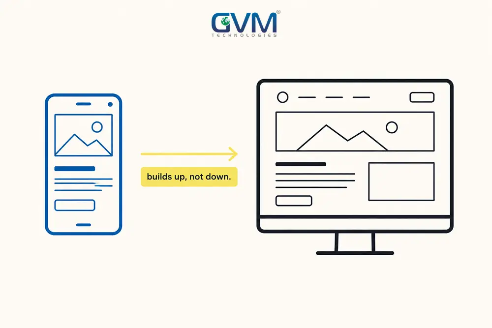
Mobile-first design means building a layout for the smallest screen first, then expanding it as screen size grows. It is a build order, not a visual style.
A user experience that only works on a laptop is now the exception, not the default.
Google finished moving its entire search index to mobile-first indexing in October 2023. Mobile devices have carried more than half of global web traffic every year since 2017. Neither fact is new. What changed is how expensive it now is to ignore both.
Quick Answer: Mobile-first design flips the traditional build order. You start with the narrowest layout, then add complexity as screen size increases. It matters in 2026 because mobile traffic overtook desktop years ago and never gave it back. Google also ranks pages using the mobile version of a site, not the desktop one.
Done well, mobile-first design produces a cleaner desktop layout, not a weaker one. Done badly, it produces a stretched mobile page pretending to be a full site.
Key Takeaways
- Mobile devices have generated more than half of global web traffic every year since 2017, with some 2026 readings running as high as 55%-60%.
- Google confirmed mobile-first indexing was complete across its entire index in October 2023, so the mobile version of a page decides how it ranks.
- “Mobile-first” is 3 separate things: a design decision, a CSS build order, and a Google indexing system. Mixing them up causes most confusion.
- Luke Wroblewski’s 2011 book “Mobile First” contains no code. The min-width CSS pattern came later, once developers turned his argument into a method.
- Desktop still converts better in most e-commerce benchmarks, roughly 3.4%-4.0% versus 1.8%-2.5% for mobile. That is a friction problem, not proof mobile-first fails.
- Mobile-first is not correct for every product. Internal dashboards and dense B2B tools used almost entirely on desktop are legitimate exceptions.
What Mobile-First Design Really Means (and Where the Term Came From)
Mobile-first web design is a specific build order. You design the smallest, most constrained screen first, then progressively add layout and content as room appears.
The origin of the term gets misunderstood almost as often as the term itself.
1. The 3 Things People Call “Mobile-First”
Ask 5 people what “mobile-first” means and you will often get 3 different, technically correct answers.
| Term | What It Actually Covers | Who Owns It |
|---|---|---|
| Mobile-first design | Prioritizing the mobile experience in layout, content, and features | Designers, product managers |
| Mobile-first development | Writing base CSS for narrow screens, then adding rules as the viewport widens | Front-end developers |
| Mobile-first indexing | Google crawling and ranking a page using its mobile version | SEO specialists |
You will see the term written both ways, mobile-first design and mobile first design. Search engines treat them the same.
If you are weighing a native app instead, mobile application design strategy is the more relevant starting point.
2. What Mobile-First Design Actually Looks Like in Practice
Google’s own search results page prioritizes 1 input field and a ranked list. Filters and side panels only appear on larger screens.
Spotify and Airbnb follow the same pattern. A single primary action stays front and center on mobile, while desktop layers in secondary tools around it.
3. Where the Term Actually Started
Google’s Eric Schmidt told the 2010 Mobile World Congress that “mobile first” was the new rule for every product Google built. That was a business statement, not a CSS technique.
Luke Wroblewski’s book “Mobile First” followed in 2011 and became design’s reference point. The book contains zero code.
The min-width CSS technique came afterward, once developers turned that argument into a working method. Most explainers skip this order entirely.
Mobile-First Design vs. Responsive Design vs. Mobile-First Indexing
These 3 terms overlap enough that people use them interchangeably. They are not, and the differences change what you should build.
1. Responsive Design Is the Umbrella, Mobile-First Is One Way to Build It
Responsive web design describes any layout that adapts to different screen sizes. It says nothing about which screen size the build started from.
Mobile-first is one specific responsive strategy: start small, then scale up.
2. Adaptive Design Is a Different Approach Again
Adaptive design serves a small set of fixed layouts tied to specific breakpoints, instead of 1 fluid layout that stretches continuously.
Confusing adaptive design with mobile-first design leads teams to build several rigid layouts when 1 flexible layout would do the job faster.
3. Mobile-First Indexing Only Cares About Content Parity
Mobile-first indexing is about what Google crawls, not how you design. If mobile and desktop show the same content and structured data, indexing changes little about your design choices.
A technical SEO audit checks for that gap in under 10 minutes.
A full search engine optimization review catches it site-wide.
Why Mobile-First Design Stopped Being Optional in 2026
The traffic numbers moved. Google’s ranking system moved with them. Businesses that adapted are converting visitors that competitors on outdated sites are quietly losing.
| Data Point | What It Shows | Source |
|---|---|---|
| Mobile traffic share | Over half of global web traffic every year since 2017, up to 55%-60% in some 2026 readings | StatCounter |
| Mobile-first indexing status | Confirmed complete across Google’s entire index in October 2023 | Google Search Central |
| Desktop conversion rate | Roughly 3.4%-4.0% on average across e-commerce benchmarks | Shopify |
| Mobile conversion rate | Roughly 1.8%-2.5% on average, gap narrowing in some 2026 datasets | Same Shopify benchmark |
| Mobile cart abandonment | 79%-85%, versus 67%-70% on desktop | Same Shopify benchmark |
1. What Google’s Mobile-First Indexing Actually Requires
Structured data, internal links, and metadata all need to exist on the mobile version, not only on desktop.
That is an indexing risk, not a design risk. It also has nothing to do with Core Web Vitals.
Indexing decides what Google sees. Core Web Vitals judges how the page performs once seen.
2. What a Skipped Mobile-First Approach Actually Costs
Skipping mobile-first design rarely fails obviously. It shows up as small failures that add up:
- Text too small to read without zooming
- Buttons close enough together that the wrong one gets tapped
- Navigation buried behind a hamburger menu that used to be 1 click away
- A hero image cropped into something unrecognizable on a narrow screen
A pattern worth watching for. A hero image cropped for a desktop banner can look completely different once stretched into a narrow mobile frame at the same aspect ratio. Fixed with focal-point cropping, not a full redesign.
Stacked together, these show up as an unexplained bounce rate and a conversion rate that lags a competitor selling the same product.
Mobile-First vs. Desktop-First: How the Build Order Changes the Outcome
Mobile-first and desktop-first differ in build order, not final capability. Both can produce a fully capable site.
1. The CSS Direction: Min-Width vs. Max-Width Media Queries
Mobile-first CSS sets default styles for the smallest screen.
It then uses min-width media queries to add complexity upward.
Desktop-first CSS does the reverse: full styles by default, with max-width rules stripping things down.
Developers have formal names for both directions:
- Progressive enhancement. Building mobile-first and adding capability upward.
- Graceful degradation. Building desktop-first and stripping capability downward.
2. Real Breakpoints Used by the 2 Most Common CSS Frameworks

There is no single official breakpoint standard. The 2 most widely used frameworks land close but do not match exactly.
| Breakpoint | Bootstrap 5 | Tailwind CSS |
|---|---|---|
| Small (sm) | 576px | 640px |
| Medium (md) | 768px | 768px |
| Large (lg) | 992px | 1024px |
| Extra large (xl) | 1200px | 1280px |
| Extra extra large | 1400px | 1536px |
Both frameworks build outward from a mobile-first default, which shows how thoroughly mobile-first won the argument among developers.
3. The Workflow Pattern Most Real Teams Actually Use
Few teams run a pure version of either approach end to end.
A pattern shows up repeatedly: design the full desktop layout first, so stakeholders see the vision, then build the CSS mobile-first.
This works because design benefits from seeing the ceiling early, while development benefits from building the floor first.
| Question | Mobile-First Approach | Desktop-First Approach |
|---|---|---|
| Where does the CSS start? | Smallest screen; min-width queries add complexity upward | Large screen; max-width queries strip complexity downward |
| What gets built first? | Core content and primary actions only | The full feature set |
| Where does it usually break? | Desktop feels sparse if extra space goes unused | Mobile feels cramped, or features get cut |
| Best fit | Public sites, e-commerce, most consumer apps | Internal dashboards, dense B2B tools |
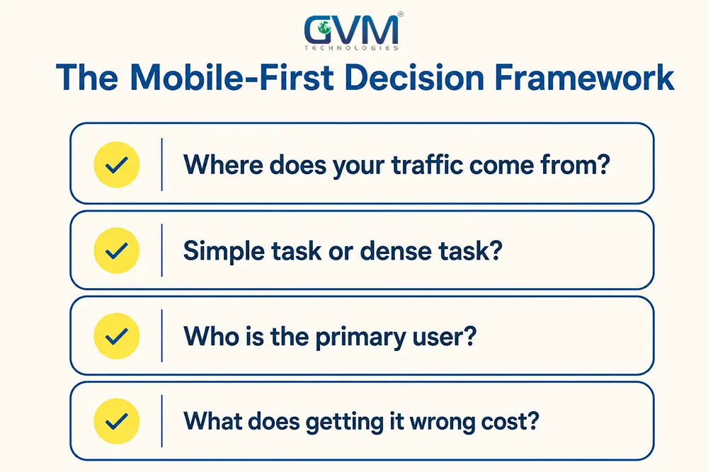
The Mobile-First Decision Framework: 4 Questions Before You Commit
Mobile-first design is the right default for most public-facing websites. It is not automatic for every project.
1. The 4 Questions That Actually Decide the Approach
| Question | Leans Mobile-First | Leans Desktop-First |
|---|---|---|
| Where does your traffic come from right now? | Mobile sessions lead or run close to desktop | Desktop sessions dominate by a wide margin |
| Is the primary task simple, or dense and comparative? | Browse, read, buy, book, contact | Comparing large data sets, dashboards |
| Who is the primary user, and what device do they reach for? | Consumers default to a phone | Specialists work at a desk by job requirement |
| What does a bad mobile experience actually cost you? | High-traffic sites lose conversions daily | Internal tools pay a smaller penalty |
2. When Desktop-First Is Still the Right Call
A recurring counter-example: an HR platform where staff search for an employee in a left-hand panel, then work across tabs of hiring data and benefits.
That kind of dense, tabbed layout is genuinely awkward on a phone, and almost nobody uses it from one. Internal dashboards and CAD tools sit in the same category.
Checking your own analytics before locking in a mobile-first strategy is worth the 10 minutes it takes.
How to Execute Mobile-First Design Without Wrecking the Desktop Experience
Building mobile-first well means treating the constraint as useful, not something to escape at the first bigger screen.
1. The Content Priority Ladder
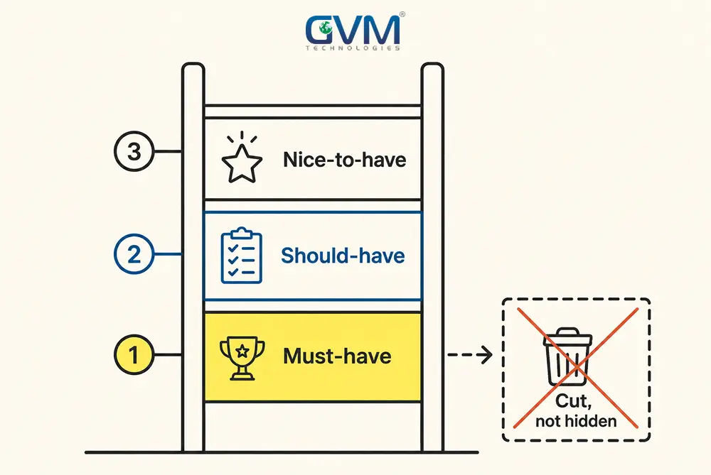
When space is scarce, content prioritization decides what earns a spot:
- Must-have, every screen size. The core action a visitor came to complete: buy, book, read, contact, sign up.
- Should-have, compresses but stays visible. Supporting information and secondary navigation.
- Nice-to-have, larger screens only. Decorative content, genuinely fine to add once there is room.
- Cut, not hidden. Anything that exists only because “the desktop version already had it.”
Most teams do not skip this ladder. They stop at rung 3 and mislabel everything as rung 1.
2. Fluid Typography Instead of Dozens of Breakpoints
CSS’s clamp function lets a single line define a minimum size, a preferred size that scales with the viewport, and a maximum size.
Typography built this way grows smoothly instead of jumping at fixed widths.
3. Image Art Direction, Not Just Flexible Width
A wide hero photo composed for a desktop banner can crop into something confusing once forced into a narrow mobile frame.
The HTML picture element lets a developer serve a genuinely different crop at different widths, not just a resized copy.
4. Touch Targets and the WCAG Reflow Connection
WCAG 2.1’s reflow success criterion requires content to reflow into a single column at 320 CSS pixels without losing information.
A button sized for a mouse pointer is not automatically sized for a fingertip. Cramped tap targets cause misclicks for rushed users, too.
Mobile-First Mistakes That Quietly Undo the Work
Most mobile-first failures come from applying the approach inconsistently, then never revisiting the decision.
1. Mobile-First Turning Into Mobile-Only
- Mobile-first is a build order. Mobile-only is a design failure that happens when a team never gives desktop a real second pass.
- You have almost certainly seen this on a desktop settings screen: large touch-friendly panels stretched wide, with acres of unused whitespace.
- Complaints about exactly this pattern in Windows 10 and 11’s Settings app, and in redesigns like GNOME’s desktop, are common for the same reason.
- This is one of several common web design myths that quietly costs businesses usability on their biggest screens.
2. Blaming the Methodology for an Ad-Density Problem
- Pop-ups, autoplaying video, and cookie banners crowding a few hundred pixels of usable height are a monetization decision, not a layout decision.
- Blaming mobile-first design for a page choked with ads is a category error. The real fix is reducing ad density.
3. Skipping Your Own Analytics Before Choosing an Approach
- The single most reliable input in this decision is your own traffic data, not the industry default.
- An analytics review pulls this device-level data, so the decision rests on evidence, not assumption.
How GVM Technologies Approaches Mobile-First Design
GVM Technologies (gvmtechnologies.com) has built and rebuilt sites across web, mobile, and SaaS since 2012.
The team works from Miami and Surat, under ISO 27001:2022, 20000-1:2018, and 9001:2015 certified processes.
1. Why Design, Development, and SEO Need to Sit on One Team
Mobile-first design sits at the intersection of 3 disciplines that often live with 3 separate vendors who never talk to each other. That gap gets checked from both ends at GVM:
- Bhumit Bodara, on web and mobile design, confirms the Content Priority Ladder shipped as designed.
- Vikas Maurya, GVM’s SEO Executive, confirms mobile-first indexing compliance before launch.
2. What a Mobile-First Readiness Check Actually Looks At
Before recommending a rebuild, GVM checks what is actually broken: content parity, touch target sizing, image cropping, real mobile load speed, and how analytics split by device.
- Sometimes the fix is a targeted website development update.
- Sometimes it is closer to a UI/UX design pass.
- Either way, QA testing verifies the fix on real devices.
GVM Technologies does not guarantee a specific ranking or conversion outcome; nobody honestly can.
The same discipline shows up in GVM’s own case studies, where design, development, and search worked as 1 team.
Talk to GVM About Your Mobile-First Strategy and get a straight answer on whether your site’s mobile experience is costing you visitors, rankings, or both.
FAQs
1. What is mobile-first design in simple terms?
Mobile-first design, sometimes called mobile-first website design, means building a layout for the smallest screen first, then adding complexity as the screen gets bigger.
2. Is mobile-first design the same as responsive design?
No. Responsive design describes any layout that adapts to different screen sizes, regardless of starting point. Mobile-first design starts specifically from the smallest screen.
3. Is mobile-first design different from adaptive design?
Yes. Adaptive design serves a small set of fixed layouts tied to specific breakpoints. Mobile-first is a fluid, continuously scaling strategy.
4. How is mobile-first design different from mobile-first indexing?
Mobile-first design is a decision about how you build the experience. Mobile first indexing (also written mobile-first indexing) is Google’s system for ranking a page using its mobile version.
5. Does every website need mobile-first design?
No. It is the right default for most public-facing sites and e-commerce stores. Internal dashboards and dense B2B tools used almost entirely on desktop are legitimate exceptions.
6. If my site is mobile-first, do I still need a separate mobile app?
Not automatically. A native app earns its cost mainly for offline access, push notifications, or device features a browser cannot reach.
7. How much does mobile-first design cost compared to a standard website build?
It depends more on scope than approach. Retrofitting mobile-first thinking onto an existing desktop-only site adds real rework. Website development costs breaks down what drives the price up or down.
Conclusion: Mobile-First Design Is a Decision, Not a Default Setting
Mobile-first design earned its place as the standard approach because traffic shifted and Google’s indexing shifted with it. None of that makes it a rule to apply blindly.
The real work comes down to 3 habits:
- Running the Mobile-First Decision Framework honestly, not by default
- Building the Content Priority Ladder with actual discipline
- Checking your own analytics instead of assuming your business matches the industry norm
GVM Technologies runs that exact readiness check before recommending a rebuild, so the fix matches what your site actually needs.
 Call us : +1 (786) 947-6105